
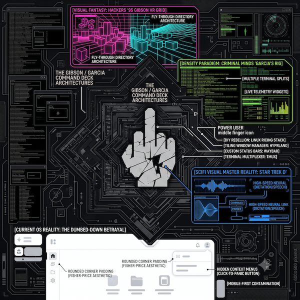
Let’s get one thing straight out of the gate: I know movie UIs are visual bullshit.
I know nobody is typing blind at 180 words per minute while flying through a glowing, neon-pink 3D cityscape of data blocks like Dade and Acid Burn in Hackers. I know Penelope Garcia’s setup in Criminal Minds—with its hyper-saturated terminal streams, custom telemetry widgets, and multi-monitor command deck—is designed for camera lenses and television drama, not eight straight hours of eye-straining ergonomics.
I get it. Hollywood built a visual metaphor for “genius at work.”
But here’s what pisses me off: we have the hardware to build interfaces that feel that powerful, and instead, we got handed Fisher-Price.
Back in the 90s, using a computer was a craft. It was an elite, high-touch skill set. You didn’t just click a pastel bubble; you had to know your IRQ addresses, edit autoexec.bat files, and navigate command prompts just to get a damn sound card to work or a game to load. The machine didn’t hold your hand, wipe your nose, or apologize for existing. It demanded that you bring some actual intelligence to the desk. Movie UIs didn’t just look cool—they captured the raw, high-voltage feeling of total control over a complex engine.
Then big tech made a massive, profitable pivot: they decided everyone needed to use a computer, from toddlers to tech-phobes who panic the second they see a flashing cursor. To cater to the absolute lowest common denominator, they sanded down every sharp edge and crippled the desktop:
- The Right-Click Funeral: Context menus used to give you instant, precise commands. Now, Windows hides power tools behind a dumbed-down menu where you have to click “Show more options” just to see what you actually wanted.
- Wasted Glass: Desktop screens are bigger and higher resolution than ever, yet we’re forced to use padded, tablet-style apps with giant rounded buttons, six inches of useless whitespace, and giant scrolling lists that fit four items per screen.
- The “Settings” Shell Game: Simple system configurations that used to live in a single, dense Control Panel are now scattered across three different half-baked, mobile-style Settings menus that hide advanced options like they’re nuclear launch codes.
- Web Pages Posing as Apps: Native software written to talk directly to your GPU has been replaced by sluggish Electron wrappers running glorified web browser tabs that eat 4GB of RAM just to show a text channel.
What the Gibson Was (And Why You Need to Watch Hackers)
For the uninitiated—or the folks who think computing started with an iPhone—let me explain what the Gibson actually was. In the 1995 cult classic Hackers, the Gibson was a corporate supercomputer whose operating system was rendered as a breathtaking, glowing, neon-pink and cyan 3D cityscape of data blocks. Navigating a file system wasn’t clicking a beige folder icon; it was soaring through skyscrapers of pure code and diving through floors of raw data. It made entering a server feel like a dogfight in a cyberpunk sky.
If you haven’t seen Hackers, stop reading this, find a copy, and watch it right now. You need to see that movie just to witness what we could have had before the tech industry decided everything needed to be shoved onto a 6-inch phone screen and stripped down to easy buttons for the masses. It was loud, absurd, visual adrenaline, and it showed a vision of computing where the user was a pilot, not a passive consumer tapping pastel bubbles.
Now, let me issue a formal apology to the general public: I get it. I’m sorry.
I realize that my dream UI will never happen on a mainstream level. I know it’s just a fucking movie. I get that if Apple or Microsoft shipped an operating system that looked like the Gibson, 99% of the population would cry, throw their laptops into a river, and demand a manager. I know you need your gigantic icons, your voice assistants, and your hand-holding so you don’t accidentally delete your family photos.
I understand why it was built this way. It just pisses me off. Because deep down, some of us don’t want a digital microwave with one big “Start” button—we want the Gibson.
The One Thing Sci-Fi Got Absolutely Right
Look, I’ll admit where modern computing actually blew the movies out of the water: voice, dictation, and speech engines.
In Star Trek, Kirk didn’t sit there tapping a mouse—he leaned over a console and spoke to the computer, and the computer spoke back. In sci-fi, voice control and screen readers were always the ultimate flex of high-tech fluidity. And today? Modern dictation, advanced screen readers, and speech parsing are phenomenal. We can literally talk to a machine, throw complex commands at it, navigate screens at light speed through audio feeds, and drive software without ever laying a finger on a trackpad.
It’s fast, precise, and fucking cool as hell. It’s the one area where real-life engineering actually matched the sci-fi dream—turning speech and assistive control into a high-speed neural link with the hardware.
Which makes the visual UI downgrade hurt even worse. We solved the hardest part—direct voice interaction and rapid audio feedback—and then slapped it inside an OS layout that looks like a toddler’s activity board.
Why 3D File Systems Break Real Brains
Now, to be fair to reality: if someone actually built the Gibson as a daily-driver operating system, you’d throw your monitor out the window by lunchtime.
Back in 1993, Silicon Graphics built FSN (File System Navigator)—a real 3D file explorer that famously landed in Jurassic Park when Lex screamed, “It’s a UNIX system! I know this!” It rendered directories as glowing towers you could fly through. It looked incredible on screen.
It was also completely unusable.
In a 3D file system, big folders block your view of small folders behind them. Navigating to a nested directory turns into an endless flight-simulator dogfight instead of a 0.2-second command line path. And layered, translucent white text over glowing 3D geometry gives you instant visual fatigue. Hollywood UIs are pure form, zero ergonomics. Modern operating systems claim to be 100% function, but they waste space and insult your intelligence.
Reclaiming the Control Deck
So where does that leave those of us who refuse to live in a sterile, pastel-colored digital nursery?
We build our own.
The spirit of Garcia’s command deck hasn’t died—it just migrated to the Linux world under the banner of desktop ricing.
If you want a machine that actually feels like a high-density, high-velocity cockpit, you toss out standard desktop managers and jump into tiling window managers like Hyprland, i3, or Sway. Windows automatically snap into place with zero bloated window frames. Custom status bars like Waybar or eww feed live system hardware metrics, network traffic, and encrypted tunnels right onto the glass. You split terminals with tmux and throw live system monitors onto secondary displays using tools like eDEX-UI. Pair that with lightning-fast dictation and custom audio triggers, and you’re suddenly running something that feels real.
It’s keyboard-driven, voice-assisted, fast, dense, and has character. It forces you to understand your tools again.
Big tech can keep building software for people who need giant rounded buttons and training wheels. Some of us prefer the cockpit.